Customizing Content Card styles
Braze Content Cards come with a default look and feel. This article covers styling options for your Content Cards to help you match your brand identity.
Customizing styling
The default Content Cards UI is imported from the UI layer of the Braze SDK. From there, you can tweak certain parts of the card’s styling, the order in which cards are displayed, and how the feed is shown to your users.
Content Card properties such as title, cardDescription, imageUrl, etc., are directly editable through the dashboard, which is the preferred method for changing these details.
By default, Android and FireOS SDK Content Cards match the standard Android UI guidelines to provide a seamless experience. You can see these default styles in the res/values/styles.xml file in the Braze SDK distribution:
1
2
3
4
5
6
7
8
9
10
11
  <style name="Braze.ContentCards.CaptionedImage.Description">
    <item name="android:textColor">@color/com_braze_description</item>
    <item name="android:textSize">15.0sp</item>
    <item name="android:includeFontPadding">false</item>
    <item name="android:paddingBottom">8.0dp</item>
    <item name="android:layout_marginLeft">10.0dp</item>
    <item name="android:layout_marginRight">10.0dp</item>
    <item name="android:layout_marginTop">8.0dp</item>
    <item name="android:layout_width">match_parent</item>
    <item name="android:layout_below">@id/com_braze_content_cards_captioned_image_card_title_container</item>
  </style>
To customize your Content Card styling, override this default style. To override a style, copy it in its entirety to the styles.xml file in your project and make modifications. The entire style must be copied over to your local styles.xml file for all attributes to be correctly set.
1
2
3
4
5
6
7
8
9
<style name="Braze.ContentCardsDisplay">
  <item name="android:background">@color/mint</item>
  <item name="android:cacheColorHint">@color/mint</item>
  <item name="android:divider">@android:color/transparent</item>
  <item name="android:dividerHeight">16.0dp</item>
  <item name="android:paddingLeft">12.5dp</item>
  <item name="android:paddingRight">5.0dp</item>
  <item name="android:scrollbarStyle">outsideInset</item>
</style>
1
2
3
4
<style name="Braze.ContentCardsDisplay">
  <item name="android:background">@color/mint</item>
  <item name="android:cacheColorHint">@color/mint</item>
</style>
By default, Android and FireOS SDK Content Cards match the standard Android UI guidelines to provide a seamless experience.
You can apply styling in one of two ways. The first is to pass a ContentCardListStyling and ContentCardStyling to ContentCardsList(), like in the following example:
1
2
3
4
5
6
7
8
9
10
11
12
13
ContentCardsList(
    style = ContentCardListStyling(listBackgroundColor = Color.Red),
    cardStyle = ContentCardStyling(
        titleTextStyle = TextStyle(
            fontFamily = fontFamily,
            fontSize = 25.sp
        ),
        shadowRadius = 10.dp,
        shortNewsContentCardStyle = BrazeShortNewsContentCardStyling(
            shadowRadius = 15.dp
        )
    )
)
The second is to use BrazeStyle to create a global styling for Braze components, like in the following example:
1
2
3
4
5
6
7
8
9
10
11
12
13
14
BrazeStyle(
    contentCardStyle = ContentCardStyling(
        textAnnouncementContentCardStyle = BrazeTextAnnouncementContentCardStyling(
            cardBackgroundColor = Color.Red,
            descriptionTextStyle = TextStyle(
                fontFamily = fontFamily,
                fontSize = 25.sp,
            )
        ),
        titleTextColor = Color.Magenta
    )
) {
    // Your app here, including any ContentCardsList() in it
}
The Content Cards view controller allows you to customize the appearance and behavior of all cells via the BrazeContentCardUI.ViewController.Attributes struct. Configuring Content Cards using Attributes is an easy option, allowing you to launch your Content Cards UI with minimal setup.
Customization via Attributes is only available in Swift.
Modifying Attributes.default
Customize the look and feel of all instances of the Braze Content Card UI view controller by directly modifying the static Attributes.defaults variable.
For example, to change the default image size and corner radius for all cells:
1
2
BrazeContentCardUI.ViewController.Attributes.defaults.cellAttributes.cornerRadius = 20
BrazeContentCardUI.ViewController.Attributes.defaults.cellAttributes.classicImageSize = CGSize(width: 65, height: 65)
Initializing the view controller with Attributes
If you wish to modify only a specific instance of the Braze Content Card UI view controller, use the init(braze:attributes:) initializer to pass a custom Attributes struct to the view controller.
For example, you can change the image size and corner radius for a specific instance of the view controller:
1
2
3
4
5
var attributes = BrazeContentCardUI.ViewController.Attributes.defaults
attributes.cellAttributes.cornerRadius = 20
attributes.cellAttributes.classicImageSize = CGSize(width: 65, height: 65)

let viewController = BrazeContentCardUI.ViewController(braze: AppDelegate.braze, attributes: attributes)
Customizing cells by subclassing
Alternatively, you can create custom interfaces by registering custom classes for each desired card type. To use your subclass instead of the default cell, modify the cells property in the Attributes struct. For example:
1
2
3
4
5
var attributes = BrazeContentCardUI.ViewController.Attributes.defaults
// Register your own custom cell
attributes.cells[BrazeContentCardUI.ClassicImageCell.identifier] = CustomClassicImageCell.self

let viewController = BrazeContentCardUI.ViewController(braze: AppDelegate.braze, attributes: attributes)
Modifying content cards programmatically
Content Cards can be changed programmatically by assigning the transform closure on your Attributes struct. The example below modifies the title and description of compatible cards:
1
2
3
4
5
6
7
8
9
10
11
12
13
14
15
var attributes = BrazeContentCardUI.ViewController.Attributes.defaults
attributes.transform = { cards in
  cards.map { card in
    var card = card
    if let title = card.title {
      card.title = "[modified] \(title)"
    }
    if let description = card.description {
      card.description = "[modified] \(description)"
    }
    return card
  }
}

let viewController = BrazeContentCardUI.ViewController(braze: AppDelegate.braze, attributes: attributes)
Check out the Examples sample app for a complete example.
Customizing Content Cards through Attributes is not supported with Objective-C.
Braze’s default styles are defined in CSS within the Braze SDK. By overriding selected styles in your application, it is possible to customize our standard feed with your own background images, font families, styles, sizes, animations, and more. For instance, the following is an example override that will cause Content Cards to appear 800 px wide:
1
2
3
body .ab-feed {
  width: 800px;
}
Customization recipes
Here are some recipes for common customization use cases.
Custom font
Customizing the font used in your Content Cards allows you to maintain your brand identity and create a visually appealing experience for your users. Use these recipes to set the font for all Content Cards programmatically.
To change the default font programmatically, set a style for cards and use the fontFamily attribute to instruct Braze to use your custom font family.
For example, to update the font on all titles for captioned image cards, override the Braze.ContentCards.CaptionedImage.Title style and reference your custom font family. The attribute value should point to a font family in your res/font directory.
Here is a truncated example with a custom font family, my_custom_font_family, referenced on the last line:
1
2
3
4
5
6
  <style name="Braze.ContentCards.CaptionedImage.Title">
    <item name="android:layout_width">wrap_content</item>
    ...
    <item name="android:fontFamily">@font/my_custom_font_family</item>
    <item name="fontFamily">@font/my_custom_font_family</item>
  </style>
For more information about font customization in the Android SDK, see the font family guide.
To change the default font programmatically, you can set the titleTextStyle of ContentCardStyling.
You can also set titleTextStyle for a specific card type by setting it on BrazeShortNewsContentCardStyling and passing it to the shortNewsContentCardStyle of ContentCardStyling.
1
2
3
4
5
6
7
8
9
val fontFamily = FontFamily(
    Font(R.font.sailec_bold)
)

ContentCardStyling(
    titleTextStyle = TextStyle(
        fontFamily = fontFamily
    )
)
Customize your fonts by customizing the Attributes of the cellAttributes instance property. For example:
1
2
3
4
5
6
var attributes = BrazeContentCardUI.ViewController.Attributes.defaults
attributes.cellAttributes.titleFont = .preferredFont(textStyle: .callout, weight: .bold)
attributes.cellAttributes.descriptionFont = .preferredFont(textStyle: .footnote, weight: .regular)
attributes.cellAttributes.domainFont = .preferredFont(textStyle: .footnote, weight: .medium)

let viewController = BrazeContentCardUI.ViewController.init(braze: braze, attributes: attributes)
Customization of fonts via Attributes is not supported in Objective-C.
Check out the Examples sample app for an example of building your own UI with custom fonts.
Just like any other web element, you can easily customize the appearance of Content Cards through CSS. In your CSS file or inline styles, use the font-family property and specify the desired font name or font stack.
1
2
3
4
/* CSS selector targeting the Content Card element */
.card-element {
  font-family: "Helvetica Neue", Arial, sans-serif;
}
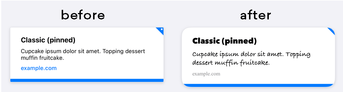
Custom pinned icons
When creating a Content Card, marketers have the option of pinning the card. A pinned card will display at the top of a user’s feed and can’t be dismissed by the user. As you customize your card styles, you have the ability to change what the pinned icon looks like.
To set a custom pinned icon, override the Braze.ContentCards.PinnedIcon style. Your custom image asset should be declared in the android:src element. For example:
1
2
3
4
5
6
7
8
9
10
  <style name="Braze.ContentCards.PinnedIcon">
    <item name="android:src">@drawable/{my_custom_image_here}</item>

    <item name="android:layout_width">wrap_content</item>
    <item name="android:layout_height">wrap_content</item>
    <item name="android:layout_alignParentRight">true</item>
    <item name="android:layout_alignParentTop">true</item>
    <item name="android:contentDescription">@null</item>
    <item name="android:importantForAccessibility">no</item>
  </style>
To change the default pinned icon, you can set the pinnedResourceId of ContentCardStyling. For example:
1
2
3
4
ContentCardStyling(
    pinnedResourceId = R.drawable.pushpin,
    pinnedImageAlignment = Alignment.TopCenter
)
You can also specify a Composable in pinnedComposable of ContentCardStyling. If pinnedComposable is specified, it will override the pinnedResourceId value.
1
2
3
4
5
6
7
8
9
10
11
12
ContentCardStyling(
    pinnedComposable = {
        Box(Modifier.fillMaxWidth()) {
            Text(
                modifier = Modifier
                    .align(Alignment.Center)
                    .width(50.dp),
                text = "This message is not read. Please read it."
            )
        }
    }
)
Customize the pin icon by modifying the pinIndicatorColor and pinIndicatorImage properties of the cellAttributes instance property. For example:
1
2
3
4
5
var attributes = BrazeContentCardUI.ViewController.Attributes.defaults
attributes.cellAttributes.pinIndicatorColor = .red
attributes.cellAttributes.pinIndicatorImage = UIImage(named: "my-image")

let viewController = BrazeContentCardUI.ViewController.init(braze: braze, attributes: attributes)
You can also use subclassing to create your own custom version of BrazeContentCardUI.Cell, which includes the pin indicator. For example:
1
2
3
4
var attributes = BrazeContentCardUI.ViewController.Attributes.defaults
attributes.cells[BrazeContentCardUI.ClassicImageCell.identifier] = CustomClassicImageCell.self

let viewController = BrazeContentCardUI.ViewController(braze: AppDelegate.braze, attributes: attributes)
Customization of the pin indicator via Attributes is not supported in Objective-C.
The structure of the Content Card pinned icon is:
1
2
3
<div class="ab-pinned-indicator">
  <i class="fa fa-star"></i>
</div>
If you want to use a different FontAwesome icon, you can simply replace the class name of the i element with the class name of the desired icon.
If you want to swap out the icon altogether, remove the i element and add the custom icon as a child of ab-pinned-indicator. There are a few different ways you can go about it, but one simple method would be to replaceChildren() on the ab-pinned-indicator element.
For example:
1
2
3
4
5
6
7
8
9
// Get the parent element
const pinnedIndicator = document.querySelector('.ab-pinned-indicator');

// Create a new custom icon element
const customIcon = document.createElement('span');
customIcon.classList.add('customIcon');

// Replace the existing icon with the custom icon
pinnedIndicator.replaceChildren(customIcon);
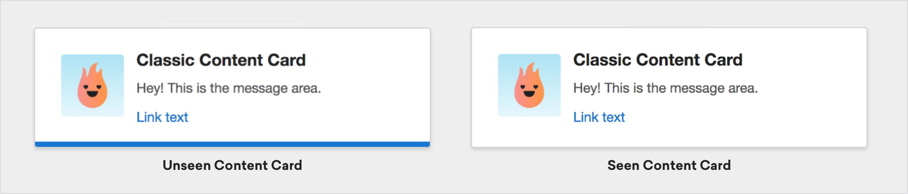
Changing the unread indicator color
Content Cards contain a blue line at the bottom of the card which indicates whether or not the card has been viewed.
Change the color of the unread indicator bar by altering the value in com_braze_content_cards_unread_bar_color in your colors.xml file:
1
2
3
4
5
<?xml version="1.0" encoding="utf-8"?>
<resources>
  <!-- The color used to highlight unread Content Cards at their bottom edge -->
  <color name="com_braze_content_cards_unread_bar_color">#1676d0</color>
</resources>
To change the color of the unread indicator bar, modify the value of unreadIndicatorColor in ContentCardStyling:
1
2
3
ContentCardStyling(
    unreadIndicatorColor = Color.Red
)
Change the color of the unread indicator bar by assigning a value to the tint color of your BrazeContentCardUI.ViewController instance:
1
2
let viewController = BrazeContentCardUI.ViewController(braze: AppDelegate.braze)
viewController.view.tintColor = .systemGreen
However, if you wish to modify only the unviewed indicator, you can access the unviewedIndicatorColor property of your BrazeContentCardUI.ViewController.Attributes struct. If you utilize Braze UITableViewCell implementations, you should access the property before the cell is drawn.
For example, to set the color of the unviewed indicator to red:
1
2
3
4
var attributes = BrazeContentCardUI.ViewController.Attributes.defaults
attributes.cellAttributes.unviewedIndicatorColor = .red

let viewController = BrazeContentCardUI.ViewController(braze: AppDelegate.braze, attributes: attributes)
Check out the Examples sample app for a complete example.
Change the color of the unread indicator bar by assigning a value to the tint color of your BRZContentCardUIViewController:
1
2
BRZContentCardUIViewController *viewController = [[BRZContentCardUIViewController alloc] initWithBraze:AppDelegate.braze];
[viewController.view setTintColor:[UIColor systemGreenColor]];
Customization of only the unviewed indicator via Attributes is not supported in Objective-C.
To change the color of the unread indicator of a card, add custom CSS to your webpage. For example, to set the color of the unviewed indicator to green:
1
.ab-unread-indicator { background-color: green; }
Disabling unread indicator
Hide the unread indicator bar by setting setUnreadBarVisible on ContentCardViewHolder to false.
Disabling the unread indicator is not supported in Jetpack Compose.
Hide the unread indicator bar by setting the attributes.cellAttributes.unviewedIndicatorColor property in your Attributes struct to .clear.
Customization of only the unviewed indicator via Attributes is not supported in Objective-C.
Hide the unread indicator bar by adding the following style to your css:
1
.ab-unread-indicator { display: none; }
 Edit this page on GitHub